
B L A C K L I G H T
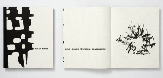
KELD HELMER-PETERSON
Helmer-Peterson was a Danish photographer. He was internationally known because of a book he published in 1948 '122 Farvefotografier (122 Colour Photographs)' which is an anthology of experiments and poems that were inspired by Albert Renger-Patzsch and Neue Sachlichkeit. This creation was particularly significant because it was known for bringing modernism to Danish photography. He pioneered a type of abstract photography which emphasises the Formal Elements, particularly texture, line and shape. This is true of both the colour and black and white work. However, his high contrast black and white images are particularly minimalist because they reduce the photographed or scanned image to black and white only with no mid tones. The photographs created by Helmer-Peterson were intended to manipulate how we view ordinary objects and places.
Helmer-Peterson was a Danish photographer. He was internationally known because of a book he published in 1948 '122 Farvefotografier (122 Colour Photographs)' which is an anthology of experiments and poems that were inspired by Albert Renger-Patzsch and Neue Sachlichkeit. This creation was particularly significant because it was known for bringing modernism to Danish photography. He pioneered a type of abstract photography which emphasises the Formal Elements, particularly texture, line and shape. This is true of both the colour and black and white work. However, his high contrast black and white images are particularly minimalist because they reduce the photographed or scanned image to black and white only with no mid tones. The photographs created by Helmer-Peterson were intended to manipulate how we view ordinary objects and places.
122 Farvefotografier (122 Colour Photographs): By Keld Helmer Peterson
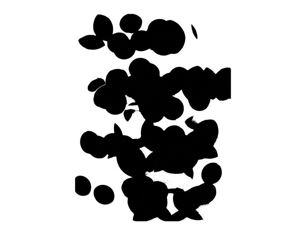
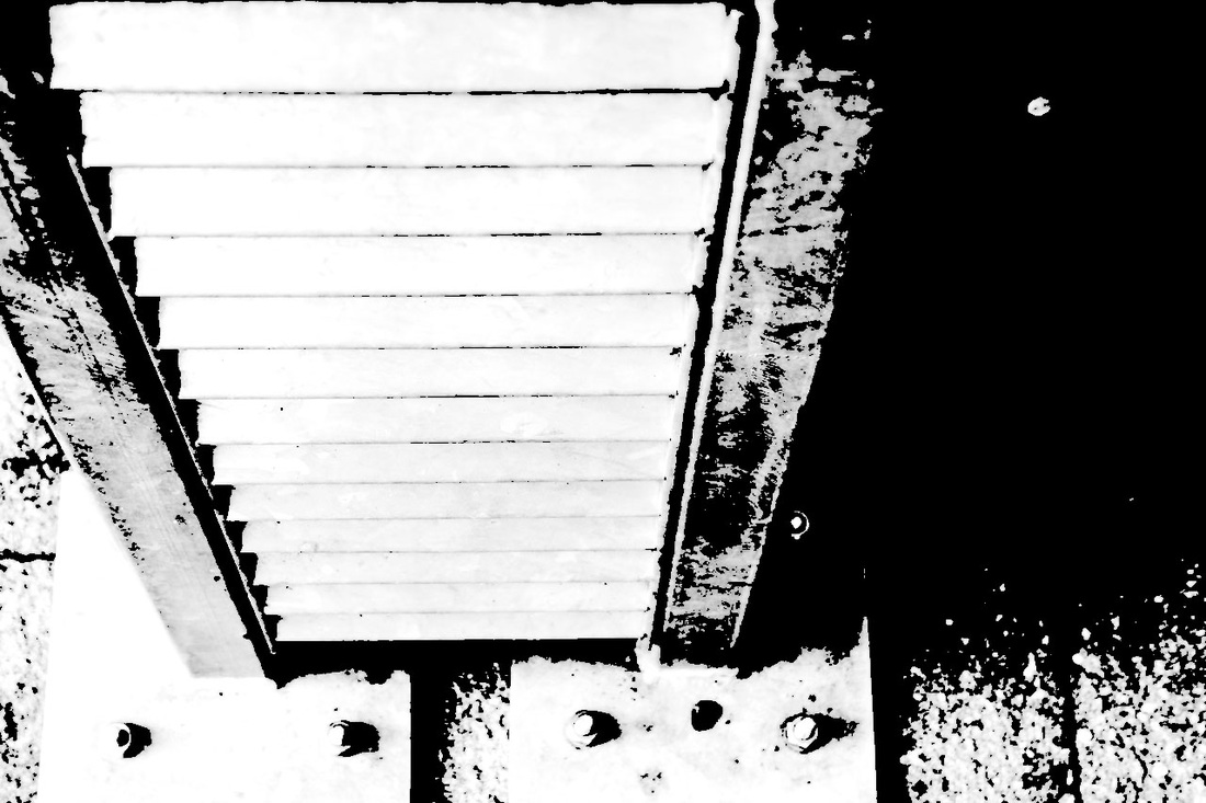
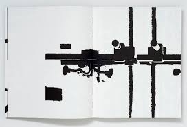
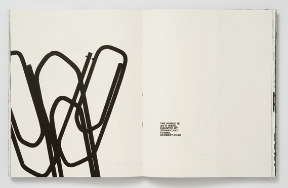
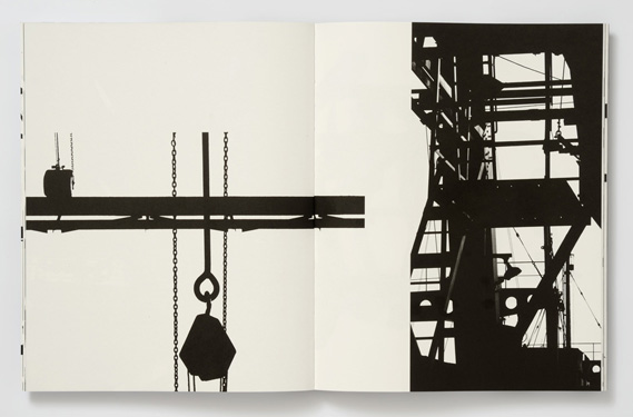
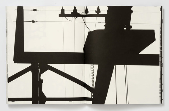
I really like Peterson's book '122 Colour Photographs' because it is a different approach to contemporary modern photography and is a style/genre that I have never encountered before. I like the abstractions and structures of his photographs, the fact that there is much negative space in comparison the the actual object/detail, makes the focus of the black details more dramatic. In addition, I noticed that some photographs overlapped two pages, whereas some such as the second image below only is fulfilled in one page whereas the other is completely blank with a small text in the bottom corner. Furthermore, I also like how the photographs are abstractly different and the fact that the image is in block colours of black and white, it transforms a 3 dimensional photograph to a solid 2 dimensional photograph because you cannot see the shadows or where the light is coming from. Moreover, it is hard to tell what the photograph is of, I could only guess what is of, for example the first image below reminds me of an abstract gun but it may be perceived by other people differently.
I really like Peterson's book '122 Colour Photographs' because it is a different approach to contemporary modern photography and is a style/genre that I have never encountered before. I like the abstractions and structures of his photographs, the fact that there is much negative space in comparison the the actual object/detail, makes the focus of the black details more dramatic. In addition, I noticed that some photographs overlapped two pages, whereas some such as the second image below only is fulfilled in one page whereas the other is completely blank with a small text in the bottom corner. Furthermore, I also like how the photographs are abstractly different and the fact that the image is in block colours of black and white, it transforms a 3 dimensional photograph to a solid 2 dimensional photograph because you cannot see the shadows or where the light is coming from. Moreover, it is hard to tell what the photograph is of, I could only guess what is of, for example the first image below reminds me of an abstract gun but it may be perceived by other people differently.
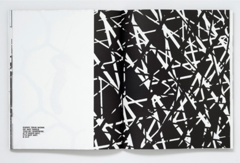
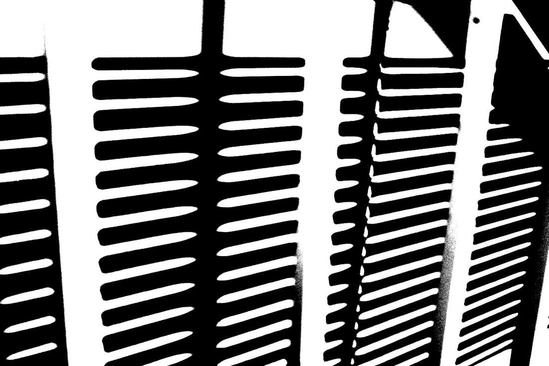
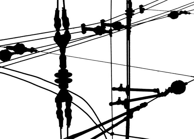
The third photograph illustrates the Formal Elements of photography, as it includes line and shadows. I expect that Keld Helmer-Peterson wanted to manipulate the object abstractly by the use of high contrasting colours of black and white. I find it fascinating because depending on the person, the photograph can be percieved differently. For example, I thought it was an up close of a radiator but I asked another person and they said it looks like a rotated drain. Which is what makes the composition that Keld Helmer-Peterson uses, very exquisite.
m y r e s p o n s e
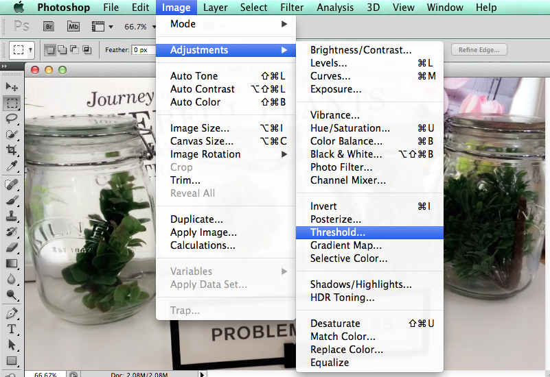
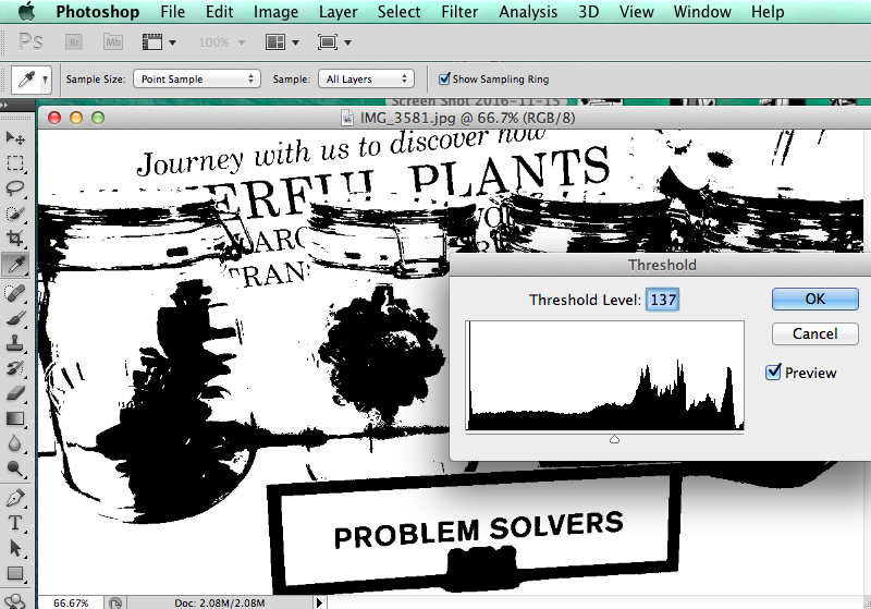
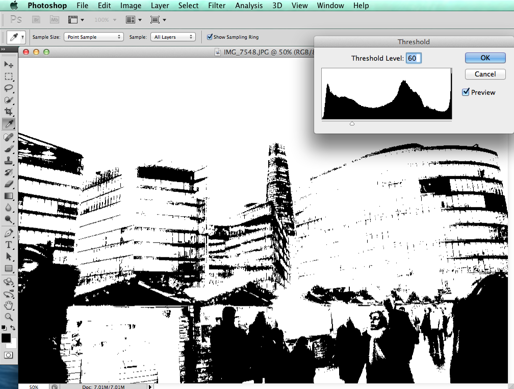
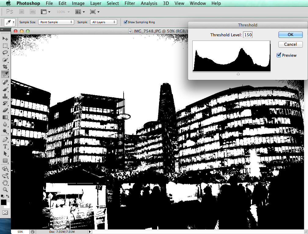
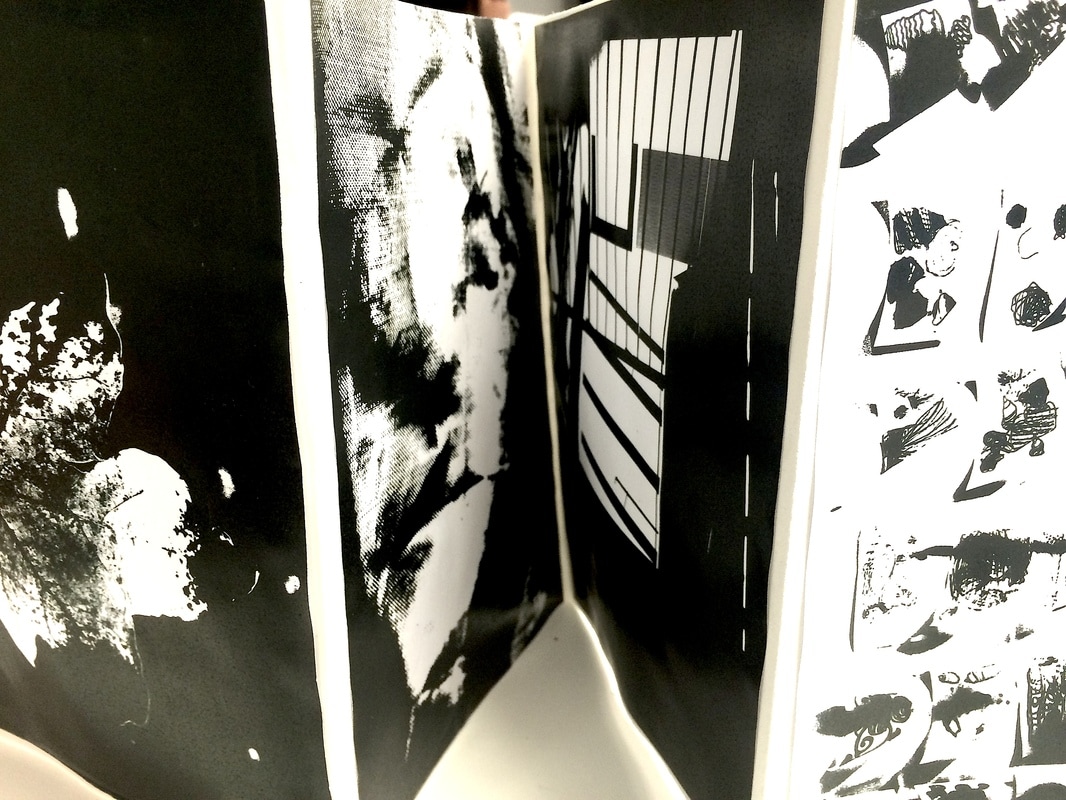
In order to recreate this threshold concept inspired by Keld Helmer-Peterson, I used Photoshop to do this. Firstly, I selected main 8 images of my own photography that I wanted to manipulate with threshold. Having done that, I activated Photoshop and placed my first selected photograph to test it out; then in order to add the threshold effect, I clicked on image at the top bar. Then multiple of options would appear and I clicked on adjustments whereby there would be further options of editing. Next, I selected ‘Threshold’ and thus a graph would appear which represents the contrast and level of threshold. In order to control and make specific adjustments, I would move along the graph until I am satisfied with the outcome.
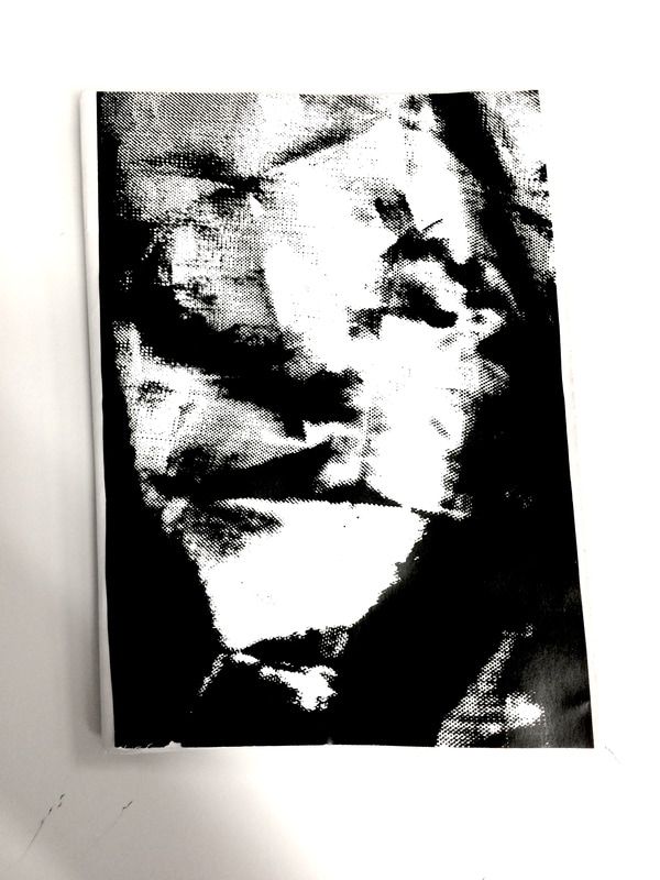
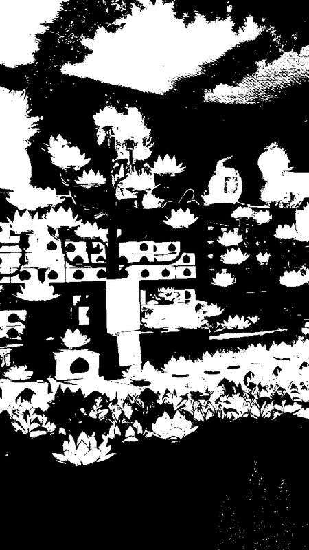
What I like about these images is the fact that it is almost hard to differentiate on what the images are actually showing in an abstract way. For example, nobody would really tell what the 2nd picture is, when it is actually a market selling lotus lamps. In addition, the 7th picture below may also be difficult to tell but it is actually a photograph I taken at an art gallery in Chelsea called 'Saatchi'.
What I like about these images is the fact that it is almost hard to differentiate on what the images are actually showing in an abstract way. For example, nobody would really tell what the 2nd picture is, when it is actually a market selling lotus lamps. In addition, the 7th picture below may also be difficult to tell but it is actually a photograph I taken at an art gallery in Chelsea called 'Saatchi'.
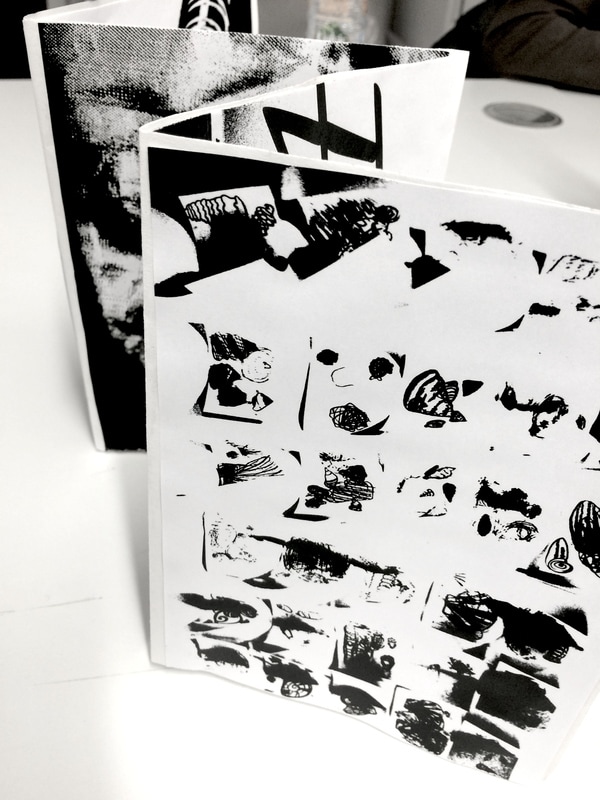
After completing the editing of my photographs, my next task was to create a book for it. I got an A2 paper and folded it until there were 8 pages, enough for the images I had. Overall, I am pleased with the outcome of my experience using Photoshop to manipulate my own pictures because it looks aesthetically abstract. However, if I was to make a change in the future, I would perhaps consider resizing the images because when I printed them out it didn't fit full to scale on the mini book I made.
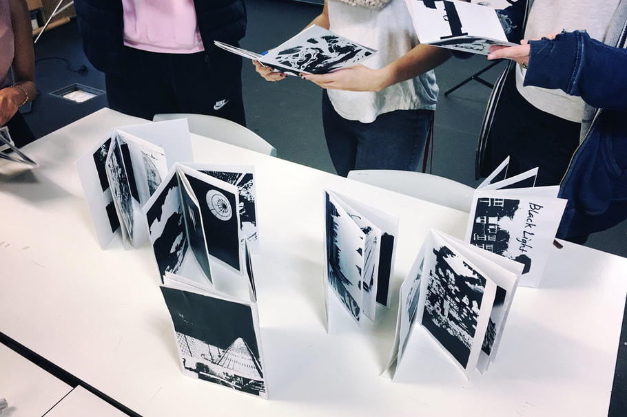
CLASS PRESENTATION/EXHIBITION
Once I completed making the book of my photographs, all of my peers' books alongside mine were exhibited on a table. It was really interesting to see other people's approaches and responses to this activity. Each book had their own genre and style, despite them all being in black and white threshold colours.
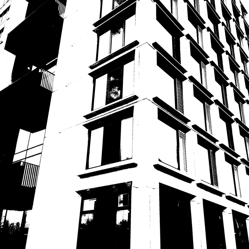
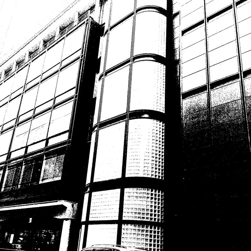
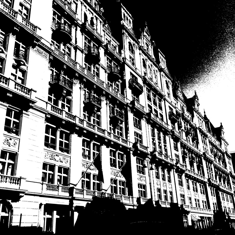
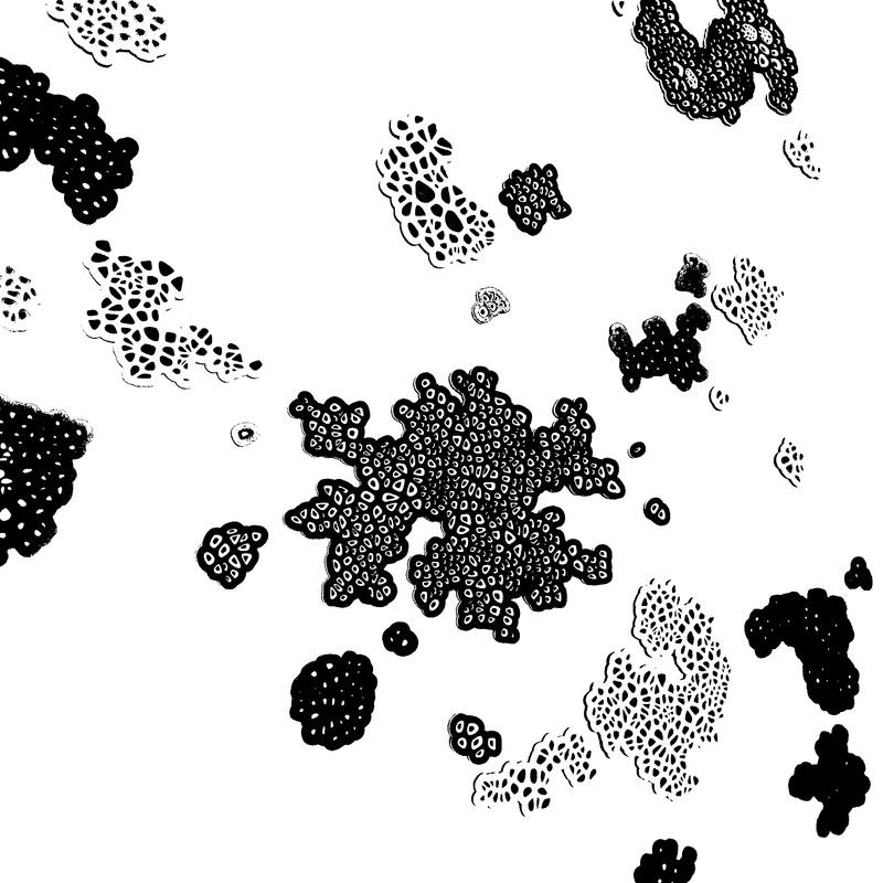
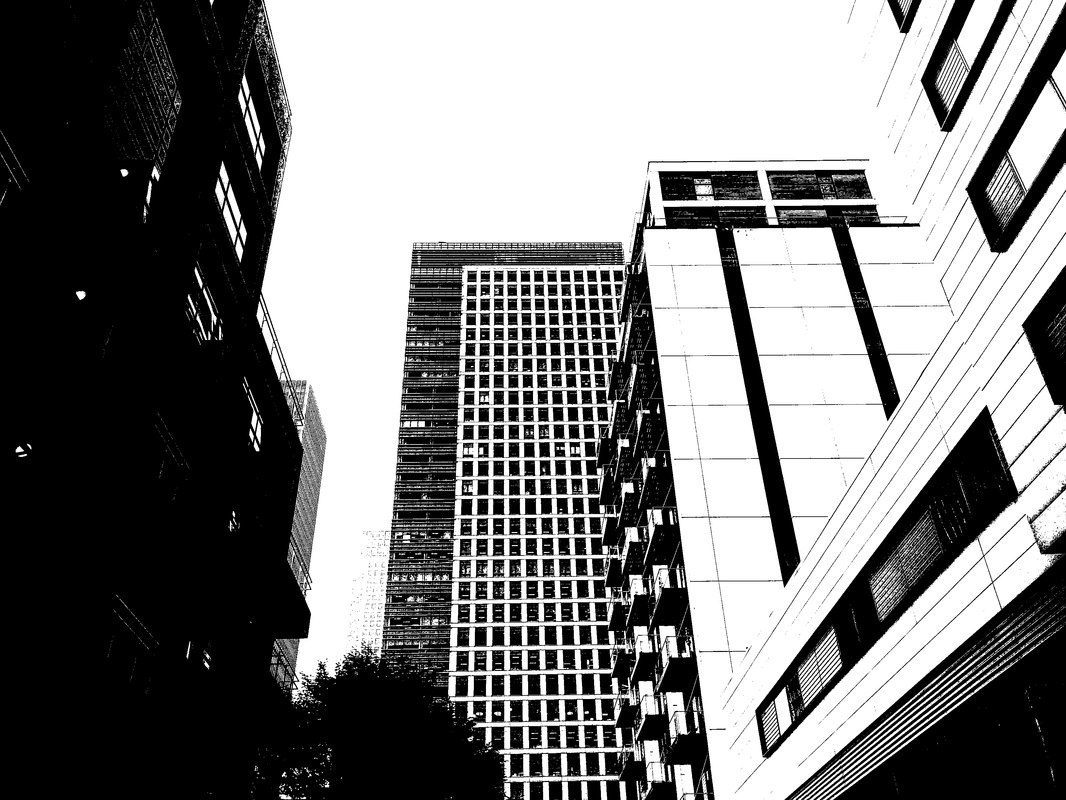
Overall, I am pleased with my final results. I was satisfied with how the solid block colours of black and white eliminated the original forms of the photograph and made it difficult to tell how the photograph was made. For example the second to last photograph below, reminds me of a microscopic detail of particles or bacteria. My favourites from the series would be the first image because I like the repeating squares of the photograph and how the photograph is structured. The threshold tool got rid of the shadows or the lighting that the building was facing so therefore the illusion of the 3 dimensional building is gone. Yet however, as the photograph is captured at an angle of the building it is still identifiable in some ways. Moreover, I particularly liked the 4th photograph below because the original photograph consisted of many reflections and lights which thus the threshold tool gave an effect of showing many lines and structures. In future, if I was to change something about my experimentation, it would be to carefully select images that aren't too exposed to light. For example the second photograph bellow and the 6th photograph came out quite faint due to that it had too much lighting in it which meant that the threshold tool enhanced the lighter areas more. The second photograph was originally a photograph of lotus lamps, as they were lit up that was probably why there is not much to the photograph.
F I N A L S L I D E S H O W : BLACK LIGHT
